

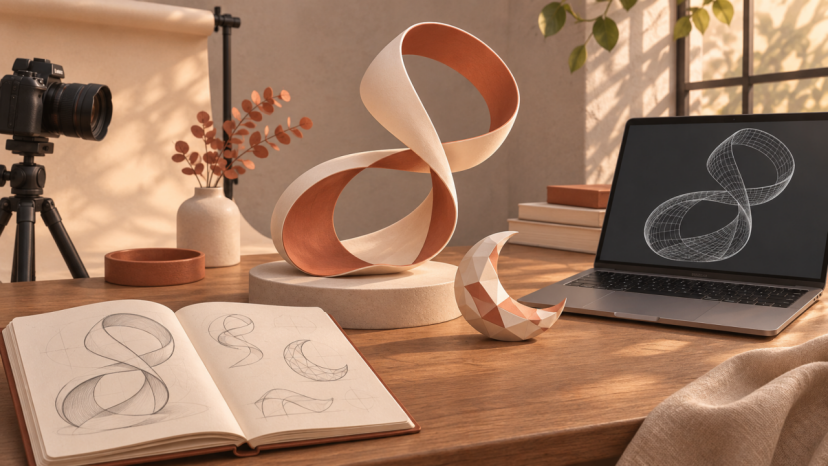
A distinctive prop can give a creator’s visual series a recognizable character. It might be a curved sculpture beside a beauty product or an imagined accessory in a fashion concept. With N4D, creators can turn text and reference images into 3D models, making it possible to explore those objects before planning a finished scene.
Using an AI 3D model generator works best when the idea already has a role. A prop should support the subject, fit the composition and leave room for the message. Starting with that brief helps a creator develop something specific instead of collecting attractive models that never make it into a post.
Give the prop a job in the frame
Decide where the object will appear and what the audience should notice first. A small ribbon sculpture could echo the curve of a bottle in a product visual. A faceted crescent might become a recurring element in an original style series. Each has a purpose that can guide its shape and placement.
Sketch a rough composition before refining the object. Mark the space needed for the subject and any text. If the post will be cropped into both portrait and square versions, check that the prop still contributes in each frame. This can reveal that a simpler shape would work better than an elaborate one.
Describe shape before adding decoration
A useful starting description identifies the object, its main silhouette and the visual qualities that matter. For example, a creator could explore a freestanding ribbon sculpture with a broad base, one open loop and softly rounded edges. That gives the generation a clearer subject than a string of mood words.
If using a reference image, choose one that communicates the form clearly. Your own sketch or an image you have permission to use can establish the direction. Keep the first experiment focused on the main shape. Small decorative details are easier to judge once the overall outline works in the composition.
Compare variations in the same scene
Generate a small set of alternatives and evaluate them against the original brief. Compare the opening in the ribbon, the width of its base and the balance between curved and straight edges. Use the same viewing angle and a similar scale so that the comparison stays useful.
An idea that looks striking by itself may compete with the subject once placed beside it. Put each promising version into a rough layout, even if the lighting and background are temporary. Choose the version that supports the visual rather than the one with the most surface detail.
Turn the model into a finished visual
The generated model is one ingredient in the final image. After export, use a suitable 3D application to position the object, adjust its material and render the scene. Alternatively, a designer can prepare a rendered prop for compositing into an existing image. The finishing method depends on the creator’s tools and experience.
Match the direction of the light, the camera perspective and the shadow beneath the object. A sculptural prop placed on a photographed table needs to appear connected to that surface. Check reflections and edge sharpness as well, since these details affect whether the prop belongs in the scene.
If the first output needs changes, identify the specific problem before trying again. A narrower base, a simpler opening or a less reflective finish gives the next version a clear objective. Keep a copy of the chosen model so that later finishing work starts from the same asset.
Build consistency across a series
A recurring prop can connect posts without making every frame identical. Reuse the selected model with different camera angles or placements while keeping its recognizable shape. Save the scene settings and materials alongside it so that a later image does not accidentally introduce a different version.
For a coordinated series, consider how the prop relates to the rest of the visual identity. A restrained palette may suit a quiet editorial layout, while a stronger color could help the object remain visible in a busy background. Judge that choice at the size people will actually see on their screens.
Separate a digital concept from a physical accessory
A virtual brooch or sculptural ornament can help communicate an aesthetic without establishing how the object would be made. A model intended for physical production needs further checks for dimensions, thickness, connections and the chosen material. An image of an accessory also cannot establish its comfort or fit when worn.
For a creator developing merchandise, use the concept to explain the direction to a qualified designer or maker. Keep the digital mockup clearly identified as a concept until a real sample exists. This lets the visual support discussion without promising a finished product that has not been produced.
Keep an organized set of creative assets
Save the chosen model, source sketch and finished renders with clear filenames. Include a short note about the intended use and the version that was approved. Before commercial publication, check the applicable permissions for reference material and the generation service you used.
Start the next visual with a brief rather than a blank search. Decide what the prop contributes, develop its form and test it in the frame. N4D gives creators a way to begin that process from text or images, while their own choices about composition and finish make the result part of a coherent visual style.
